The Dashboard page allows Owners and Admins to get an overview of Locker usage within their organization, including member participation, login activity, password security status, and billing. These activities are displayed through numbers and visual charts. You can also view more detailed information by clicking the link in each section.
User Ratio Chart
On the Dashboard, Owners and Admins can monitor the ratio of users who have joined their Locker for Business plan through the pie chart below: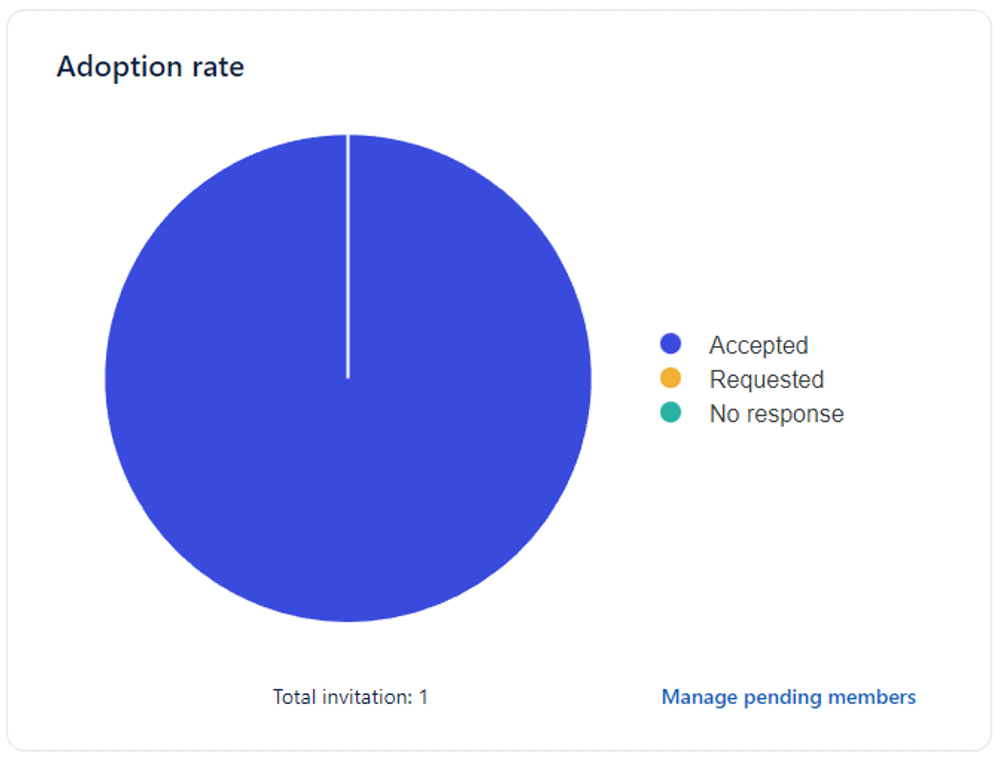
- Blue represents the ratio of confirmed users.
- Yellow represents the ratio of users who have requested to join.
- Teal represents the ratio of users who have not yet responded.
News
The News section displays the latest notifications for your Locker for Business plan, as well as members’ usage of the Locker password manager. The information includes:- Number of users who have requested to join your Locker plan. Click the Manage Requests link to see details.
- Number of accounts in the payment invoice. Go to Invoices & Billing for details.
- Number of domains pending verification. Verify domains by clicking the Manage Domains link.
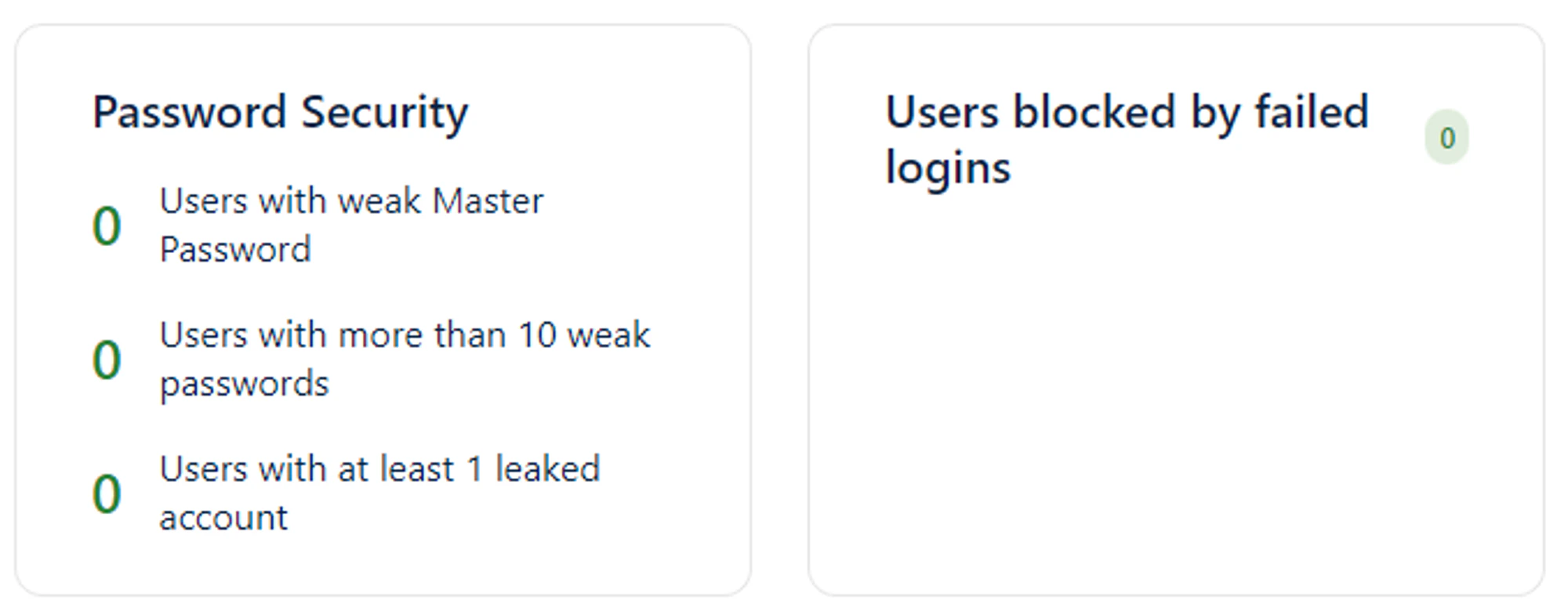
- Number of users blocked from logging in due to multiple failed login attempts. Go to Manage Locked Users for details.
Login Activity
With the chart showing the total number of member logins per day, administrators can track how many members log in to their accounts on apps and websites using Locker. The vertical axis (Y) of the chart represents the number of members who logged in using Locker, while the horizontal axis (X) shows the dates for the most recent 8 days. You can also view detailed login data for today, yesterday, the last 7 days, this month, the last 30 days, last month, or a custom range by selecting start and end dates in the filter above the chart. This helps you assess password manager usage among employees and develop appropriate plans to improve enterprise security.Password Security